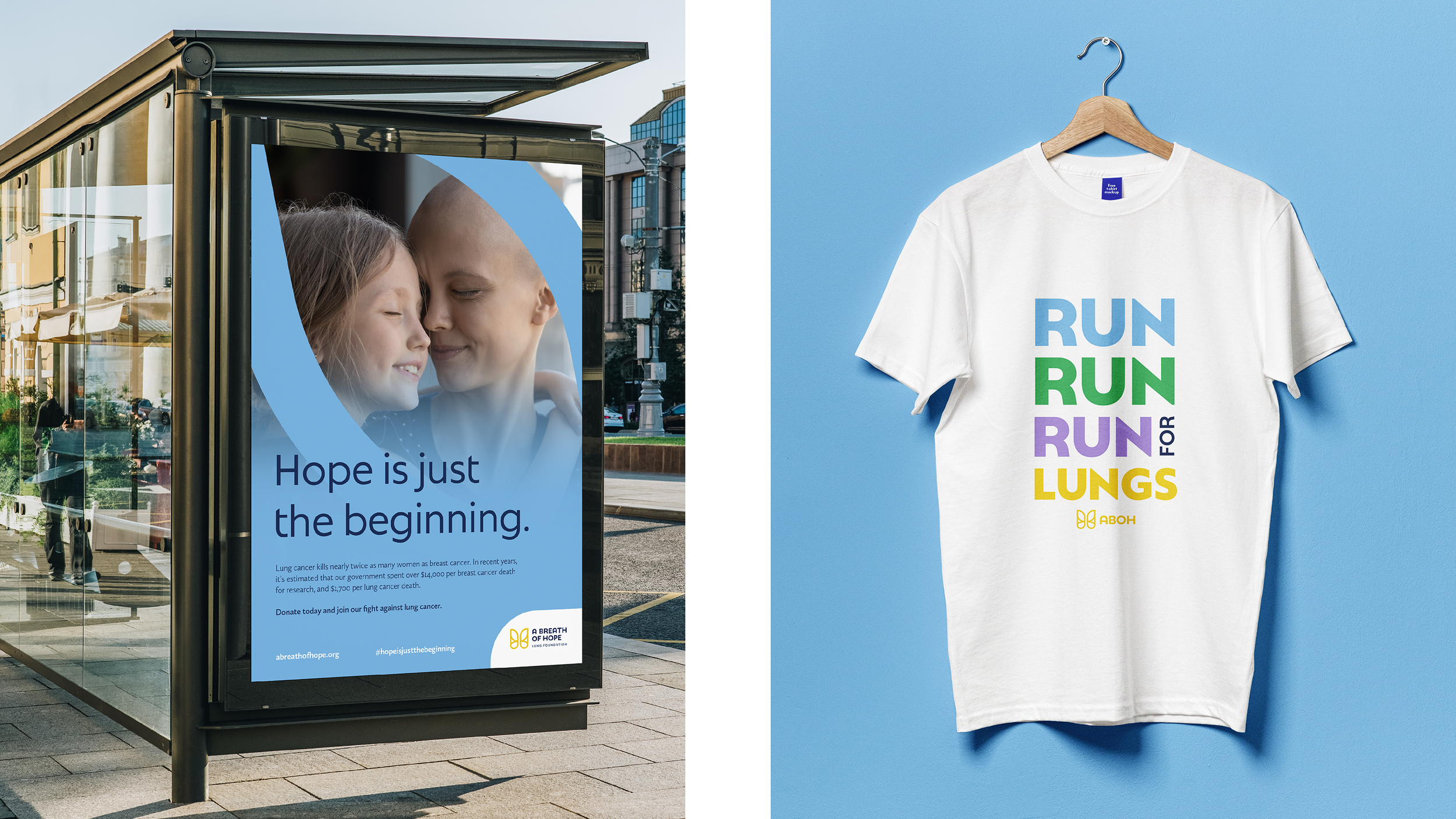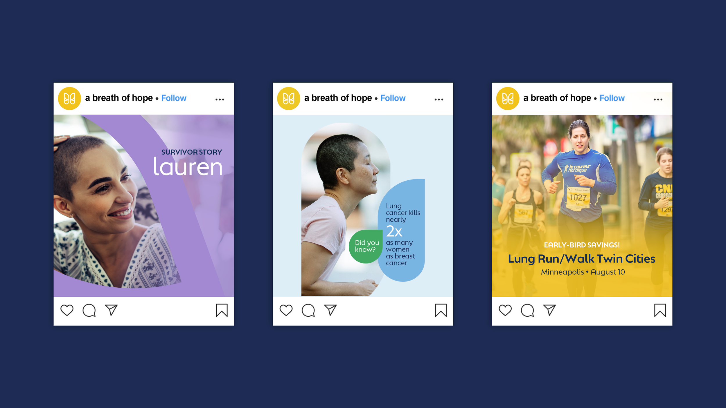
A Breath of Hope
Lung Foundation
Creative Strategy
Brand Identity
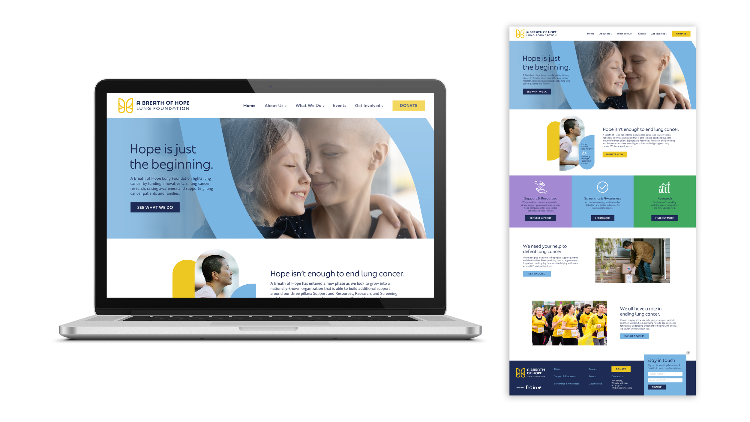
Web Design
Print
Digital
Apparel
A Breath of Hope Lung Foundation fights lung cancer by funding research, raising awareness, and supporting patients and their families. The foundation was ready to establish itself as a major presence in the lung cancer community, and sought a new strategy and updated look to increase its national recognition.
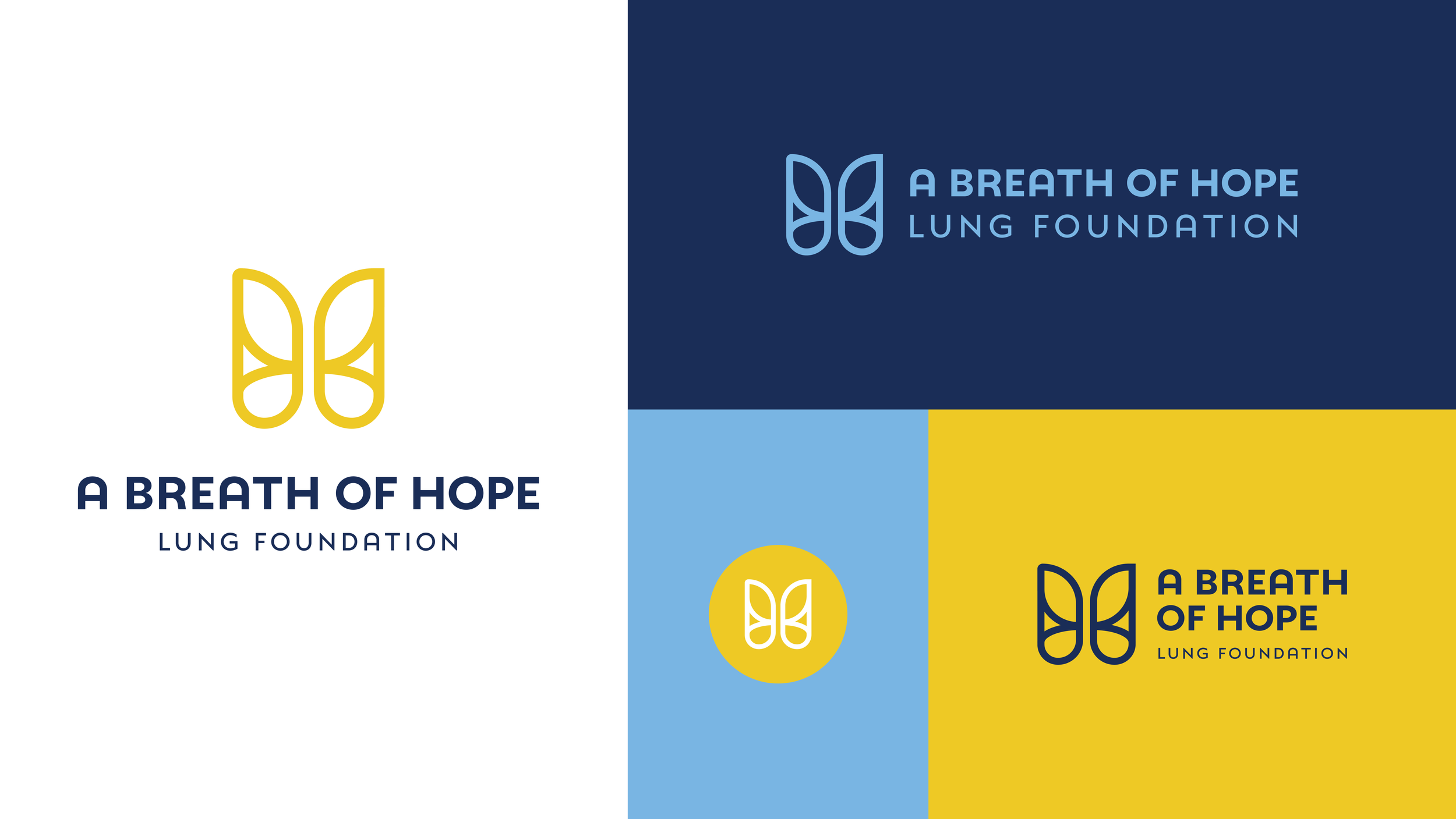
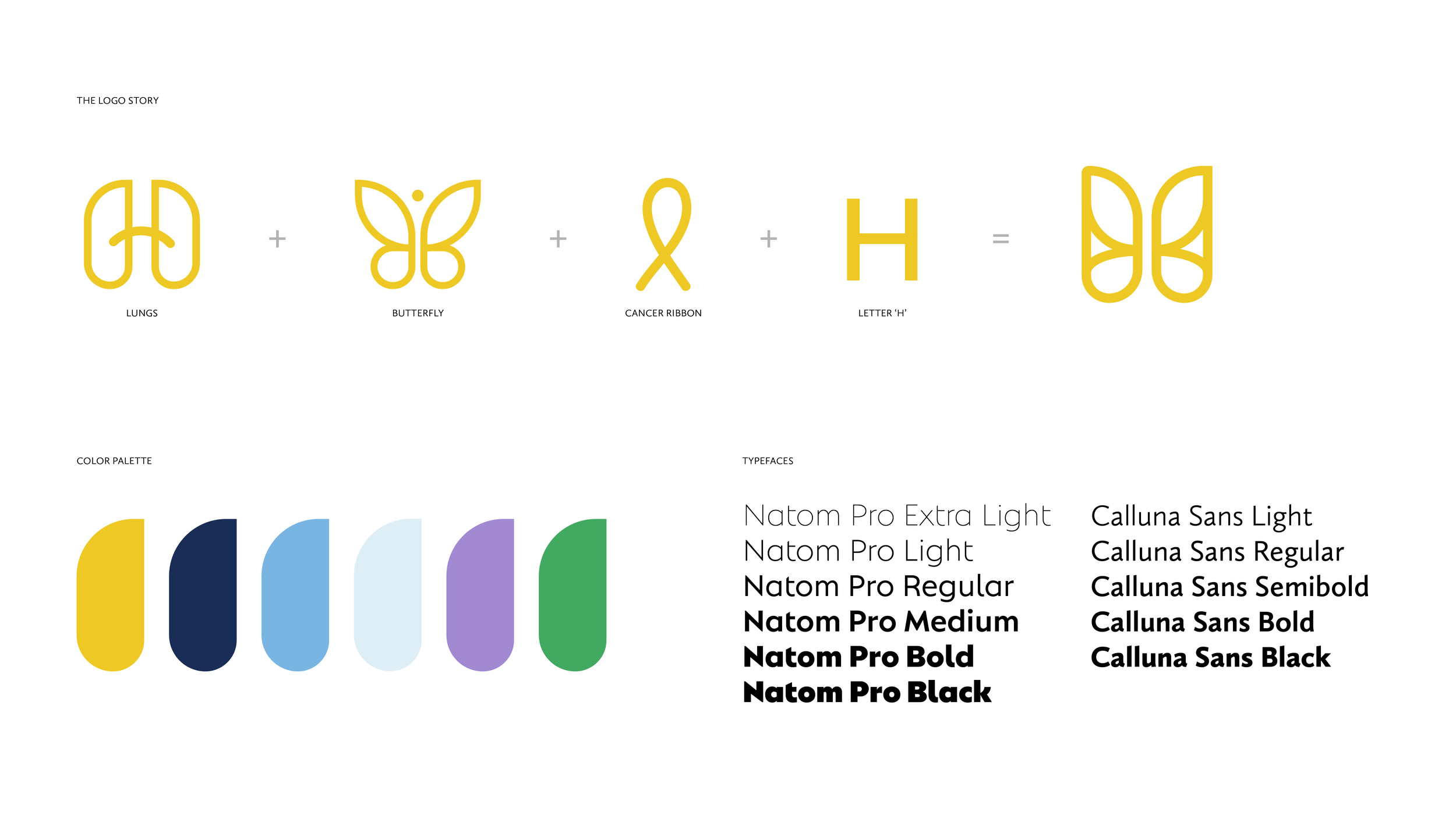
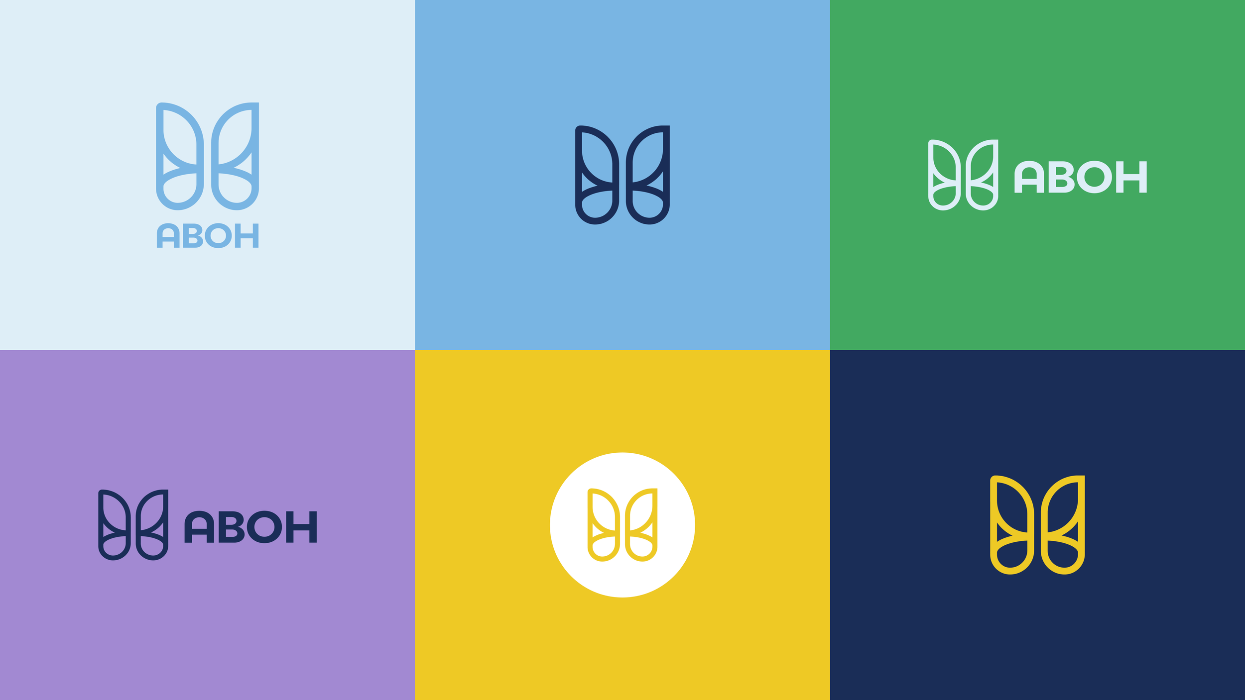
In creating their new branding, it was important to ensure that the design conveyed optimism and professionalism, centered around the concept of hope. We developed a unique logo that could be used in various ways with many variations. The butterfly and the color yellow are both symbols of hope, serving as the basis for the logo design. We merged the idea of the butterfly with a pair of lungs and the letter "H" in a style that evokes the feeling of a cancer ribbon. The new look has a modern, uplifting, yet grounded feel.